
Final Brand Kit
Blooming Health
Your Health. Your Way.
Concierge Primary Care · Baltimore
01 · Brand Identity
A guide, not a gatekeeper.
Blooming Health is a concierge primary care practice in the Baltimore area, built by a clinician who got tired of watching medicine get rushed. The founding frustration was simple: short visits, no real access, and patients leaving the room feeling unheard.
The practice is led by a nurse practitioner trained in emergency medicine, with more than a decade spent caring for this community, most recently in urgent care. Primary care is the natural next chapter: the same clinical steadiness that handles the worst day of someone's life, now applied before the emergency instead of after it.
The model is built around that idea. Fewer patients, longer visits, and a direct line to a provider who works as a guide helping you make informed decisions, not a figure dictating them. Care is evidence based, and it pairs real medicine with the practical things that actually move health over a lifetime: nutrition, movement, prevention, and steady habits.
It is worth being clear about what this is not. It is not functional medicine. It is not alternative medicine. It is not a spa. It is modern primary care organized around one honest idea, a meaningful relationship between a patient and a provider who has the time to know them.
Collaboration
Decisions made with the patient, not handed down to them.
Patient Autonomy
The patient sets the direction. The provider helps them get there.
Education
Plain explanations that leave people more informed than they came in.
Access
A direct line to your provider, when you actually need it.
Prevention
Catching things early and building health, not just treating illness.
Trust
The same provider over years, who stands behind every visit.
Access
A direct line to your provider, when you actually need it.
Collaboration
Decisions made with the patient, not handed down to them.
Patient Autonomy
The patient sets the direction. The provider helps them get there.
CEducation
Plain explanations that leave people more informed than they came in.
Prevention
Catching things early and building health, not just treating illness.
Trust
The same provider over years, who stands behind every visit.
Who it is for
Patients 13 and up. Teens and their parents, professionals, business owners, and health conscious adults, anyone done with rushed, impersonal primary care. The brand itself speaks to the adults choosing and paying for that care, so it stays refined and grown up.
What they want
Direct access to their provider, longer visits, personalized care, thoughtful decisions made together, and medicine that looks ahead at prevention, for themselves and for their families.
02 · Personality & Mandate
Calm, intelligent, and quietly premium.
The brand should feel like a private advisory firm that happens to practice medicine. Refined without being cold, approachable without being casual. It needs to land equally with men and women, which rules out anything that reads as feminine wellness or as a corporate hospital.
The personality, in eight words
The mandate · what we never do
The north star: timeless over trendy, premium over loud. If a choice would look dated in five years, it is the wrong choice.
03 · Color
Jewel tones on warm ivory.
Three deep primaries do the heavy lifting, a single sage accent carries the idea of growth, and warm ivory keeps the whole system from ever feeling clinical. Bright, neon, and trendy are off the table on purpose.
Deep Plum
Primary · Authority
HEX #4A2A43
RGB 74 · 42 · 67
Rich Navy
Primary · Trust
HEX #1B2A45
RGB 27 · 42 · 69
Slate Blue
Secondary · Calm
HEX #44597A
RGB 68 · 89 · 122
Sage Green
Accent · Growth
HEX #889A7C
Deep text variant #6E7F62
Soft Gray
Utility · Rules & UI
HEX #C9CDD3
RGB 201 · 205 · 211
Warm Ivory
Ground · Background
HEX #F6F2E9
RGB 246 · 242 · 233
Ivory ground
Plum
Navy
Slate
Sage
Rough working balance. Let ivory carry the space, plum and navy lead, slate supports, and sage stays the rare accent.
04 · Typography
Editorial serif, clean sans.
Two serifs for character and one geometric sans for everything functional. All three are free and load anywhere, including Canva and the web, so the system stays consistent across whoever is building.
Display · Headlines
Fraunces · Medium / SemiBold
Prevention is the long game.
For headlines, the practice name, and any moment that needs warmth and authority. A modern serif with real character that keeps the brand from feeling generic.
Accent · Pull Quotes & Tagline
Cormorant Garamond · SemiBold / Italic
Your Health. Your Way.
An elegant high contrast serif for taglines, pull quotes, and the rare flourish. Used sparingly, it adds the maison feel without taking over.
Body · UI & Captions
Jost · Light / Regular / Medium
Clear, plain, and easy to read.
The workhorse for body copy, navigation, forms, captions, and anything a patient actually has to read. Calm, geometric, and quietly modern.
ABCDEFGHIJKLMNOPQRSTUVWXYZ · abcdefghijklmnopqrstuvwxyz · 0123456789
05 · Brand Voice
How Blooming Health talks.
The voice is the personality written down. Say the thing plainly, treat the reader as intelligent, and never oversell. The practice earns trust by sounding like a calm expert who has time for you, because that is exactly what it is.
Direct, not curt
Respect the reader’s time.
Lead with the point. Short sentences are fine. Clarity is a form of respect, and patients are tired of vague.
Warm, not soft
Human, without losing authority.
Write like a real person who knows their stuff. Kind and plainspoken, never gushing or performative.
Intelligent, not clinical
Smart, never jargon for its own sake.
Explain things the way a good clinician explains them across a table. Informed, never cold or coded.
Calm, not loud
Confident enough not to shout.
No hype, no fear, no exclamation pileups. The quiet confidence is the sell.
Words and moves we use
Guide, partner, together, with you
Time, access, unhurried, reachable
Prevention, ahead of it, build, long term
Clear, plain, informed, your decision
Plain periods and commas for rhythm
Words and moves we avoid
Holistic, journey, wellness buzzwords
Revolutionary, game changing, cutting edge
Fear based lines and scare tactics
Exclamation marks and hard sell CTAs
Em dashes and anything that sounds like a brochure
Hero: Primary care with the time to actually know you.
About: We built Blooming Health because good medicine takes time, and we were tired of practices that do not give it.
Call to action: See how membership works.
06 · Logo
The mark.
The Counsel is the chosen mark. Two circles sit in conversation, a grounded plum disc and a lighter sage ring, neither one ruling the other. That is the founding idea of the practice in a single image: the patient is the second half of the decision, not a smaller version of the provider. The system is simple enough to hold up from a favicon to a building sign. Below is the primary lockup, the reversed versions for dark grounds, and the mark on its own.
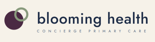
Primary lockup

Reversed · Plum

Reversed · Navy

The mark · favicon & avatar

The mark · reversed
Clear space
Keep open space around the mark equal to the height of the B. Let it breathe, especially on signage.
Minimum size
Wordmark stays legible to about 120px wide on screen. Below that, switch to the icon or badge version.
What not to do
No recoloring outside the palette, no stretching, no drop shadows or gradients, no busy photo backgrounds behind it.
Clear space
Keep open space around the mark equal to the height of the B. Let it breathe, especially on signage.
Minimum size
Wordmark stays legible to about 120px wide on screen. Below that, switch to the icon or badge version.
What not to do
No recoloring outside the palette, no stretching, no drop shadows or gradients, no busy photo backgrounds behind it.
Blooming Health
Final Brand Kit · Concierge Primary Care, Baltimore