
Crafted Care Pediatrics
Crafted Care
Pediatrics
Crafting a lifetime of health, one chapter at a time.
Pediatric Direct Primary Care · North Fort Worth, Texas · Opening December 2026
Handmade medicine for growing families.
Krystyna Wesp, DO crochets hats for her newborn patients and hands out books in clinic. That is the practice. The identity only has to be honest about it.
Most pediatric branding reaches for the same shelf: primary colors, cartoon animals, balloons, a crayon wordmark. It reads as a waiting room, and it tells a parent nothing about the doctor. Crafted Care goes the other direction. The palette is sage and coral on book paper. The mark is a parent holding a child, drawn in one continuous line, resting on an open book. The texture in this brand is real, because the handmade part of the practice is real and a competitor cannot copy it without looking like a copy.
The audience is the parent, not the child. Usually a tired mother or father who has spent seven minutes with a pediatrician who was already late. Every choice below is aimed at that person.
Handmade
Books, yarn, hats for newborns. The craft is the differentiator, so it leads the visual system instead of decorating it.
Unhurried
Her word, and better than anything we would write. Generous spacing, long line lengths, and copy that never rushes.
Whole child
Birth through 21, including behavioral health, newborn care, osteopathic manipulative medicine, and home visits for the first two months.
Warm and specific, never cute.
Warmth here comes from precision. Naming the crochet hats does more for a parent than any amount of soft language about caring deeply.
Reads as
Warm
Unhurried
Reassuring
Specific
Confident
Plainspoken
Handmade
Grounded
Never reads as
Cartoonish
Clinical
Breathless
Cutesy
Cartoonish
Corporate
Primary colors
Balloons
Sage and coral on book paper.
Sage and coral came from the client. Paper, moss, and the two tints exist so the pair has somewhere to live at full page scale.
Sage Deep
Primary. Headings, logo ink, reversed panels.
#3A4A3C
Coral
Brand accent. Fills and panels only.
#E1725A
Paper
Page ground. Warm, close to book stock.
#F7F3EA
Moss
Secondary text. Captions, metadata, nav.
#3A4A3C
Coral Deep
Accent text. Links, the tagline, small emphasis.
#E1725A
Sage
Fill only. Rules, illustration, flat shapes.
#F7F3EA
Sage Mist
Tint panel. Quiet section breaks.
#3A4A3C
Coral Blush
Tint panel. Callouts and warnings.
#E1725A
Ink
Body copy. A green-black, never pure black.
#F7F3EA
Paper
Sage Deep
Mist
Working balance across a page. Paper carries the space, Sage Deep leads, and coral stays scarce enough that it still registers when it appears.
Text rules. Sage and Coral are fill colors and never carry text. For type on paper use Sage Deep at 8.52:1, Ink at 12.39:1, Moss at 5.43:1, or Coral Deep at 5.23:1. Reversed, use Paper on Sage Deep at 8.52:1. Every combination in this kit clears WCAG AA for body text.
Old-style serif with a humanist sans.
Two families, no exceptions. The serif answers to the logo wordmark, and the sans keeps long-form patient copy easy to read on a phone at 2am.
Unhurried care
EB Garamond
Display. Headlines, section titles, pull quotes, the tagline. Weights 400, 500, 600.
An old-style serif with the same high-contrast, bookish structure as the Crafted Care wordmark. It carries the reading and quilting story without any of it being said out loud, and it sets beautifully at large sizes.
Same-day and next-day
Figtree
Body. Running text, navigation, forms, buttons, captions, all caps labels. Weights 400, 500, 600, 700.
A humanist sans that is friendly without being childish, which is the narrow target for a pediatric practice trying to avoid the crayon shelf. It holds up in small sizes and long paragraphs.
| STEP | SIZE | FAMILY | USE |
|---|---|---|---|
| Display | 44 to 68px | EB Garamond 500 | Page titles, hero |
| Section | 32 to 44px | EB Garamond 500 | Section headings |
| Lead | 20 to 24px | EB Garamond 400 | Opening paragraph, pull quotes |
| Subhead | 24px | EB Garamond 600 | Card and block titles |
| Body | 17px | Figtree 400 | Running text |
| Small | 16px | Figtree 400 | Captions, secondary notes |
| Label | 15px | Figtree 600, caps | Metadata, section labels |
15px is the floor on desktop and 16px on mobile. Tracking is applied to all caps labels only, because tightly set caps are hard to parse. Running text is never tracked.
How Crafted Care talks.
Write to the parent. Name the feeling of the rushed seven-minute visit, and never name a competitor.
Your pediatrician has time for the question you were going to ask in the parking lot.
Names the specific failure of a rushed visit without attacking anyone.
The first two months, we come to you.
Home visits from birth to two months are a genuine standout. Say it flatly and let it land.
Every newborn goes home with a hat I made. Every visit ends with a book.
First person from Dr. Wesp. The craft is the differentiator, so it appears as fact, not as a brand story.
We vaccinate on schedule, and we will talk it through as long as you need.
A clear position stated once, calmly, without picking a fight.
Never write 24/7
Also never around the clock, always available, or anytime access. Dr. Wesp told us directly that she is a mother and a patient before she is a 24 hour physician. Write direct access, same-day and next-day availability.
Never soften the vaccine position
She wants families who vaccinate. Do not write we support your choices or anything that reads as neutral. State the practice vaccinates and move on.
The call to action changes at launch
Until the December opening, every call to action is join the waitlist. On opening day it becomes schedule a meet-and-greet, sitewide and across social.
Write to the parent
The buyer is an exhausted mother or father. Warmth comes from specifics, so name the hat, the book, the home visit. Skip the language about caring deeply.
The mark.
A parent and child drawn as one continuous line, resting on an open book. The book is the ground the figures sit on, which is the whole idea of the practice in one shape.
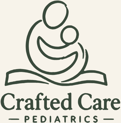
Primary lockup. Sage Deep on Paper.

Reversed. Paper on Sage Deep.

Mark alone. Use where the name is already present.

Mark on Coral. Sage Deep ink, for social tiles and covers.

Wordmark alone. Email signatures, footers, tight horizontal spaces.

Wordmark on Paper.

64, 32 and 24px. The drawn mark holds down to 24px and closes up below that, because the line weight is finer than one pixel at 16px. A simplified single-weight favicon still needs to be drawn.
Clear space. Keep a margin equal to the height of the child's head on all four sides of the lockup, and never place the mark on a photograph or a pattern. Minimum size. 120px wide for the full lockup, 24px for the mark alone. Do not recolor the mark outside this palette, add a drop shadow, stretch it, or set the wordmark in any face other than the drawn original.
Status and open items
The logo and wordmark here are traced from the approved Crafted Care mark in the Canva brand kit. The palette, type pairing, voice rules, and scale in this document are a JumpStart proposal and have not been through a client approval round.
- Confirm the sage and coral hex values against Dr. Wesp before any asset ships.
- Confirm the type pairing. The prior working note said Literata, which does not match the serif in the wordmark.
- Verify the claim that Crafted Care is the first pediatric direct primary care practice in North Fort Worth before it appears in a headline.
- Membership pricing and age bands are unknown. No figure appears in this kit.
- Confirm the exact December opening date so the call to action switch can be scheduled.
- Draw a simplified favicon. The line weight in the full mark closes up below 24px.
Prepared by JumpStart DPC Solutions for Crafted Care Pediatrics. Draft, September 2026.