

When the marketing outgrows the website.
JumpStart was already running SEO, social media, and content for Evolve Gynecology. The strategy was working. But every patient we drove to the site landed on a page that looked like a 2004 insurance clinic. Not a concierge practice charging $150 a month for unlimited physician access.
Redesigning an outdated website to match and represent a luxury, concierge practice.
The marketing was working. The website wasn't closing.
Dr. Toni Hodges-Wills, DO, FACOG, MSCP had been running Evolve Gynecology since 2023 on a traditional insurance model. In 2026 she transitioned to concierge direct specialty care: unlimited visits, direct physician access, no copays, membership pricing starting at $150/month. JumpStart was already her marketing agency, running SEO, Instagram, Facebook, and LinkedIn content built around that concierge positioning.
The social content was performing. Search rankings were climbing. But every piece of that work pointed to a website that hadn't been touched since the insurance era. Dr. Hodges-Wills hadn't planned to redo it. We made the case that we had to.
Client
Evolve Gynecology
851 S. Rampart Blvd., Suite 260 · Las Vegas, NV
Woman-owned · Concierge model launched April 2026
Dr. Toni Hodges-Wills, DO, FACOG, MSCP · Menopause Society Certified Practitioner. Specialties: adolescent gynecology, menopause care, reproductive health education.
3
Active channels JumpStart was running before the site was fixed
$150
Monthly membership the old site made no mention of on the homepage
0
Photos of the actual practice, physician, or patients on the original home page
A concierge practice sending patients to an insurance-era website.
The website wasn't just outdated. It actively contradicted the brand we were building in every other channel. Blocky sections, poor padding, no hierarchy, generic stock imagery. A patient who found us through a well-crafted Instagram post or a targeted Google search landed somewhere that looked nothing like what we were promising.
1
The site looked like 2004 HTML
Blocky sections with poor padding and no breathing room. Poppins at the same weight across every element. No visual hierarchy telling a patient where to look or what mattered. It felt like an early insurance clinic directory page, not a premium healthcare practice.
2
The concierge model was invisible
Membership pricing was buried below two full-screen blocks of generic clinic copy. A patient could read past the fold (or leave the page) without ever seeing that Evolve offered unlimited visits and direct physician access. The primary differentiator was an afterthought.
3
Our socials were writing checks the website couldn't cash
Every Instagram caption, LinkedIn post, and SEO article was built around Dr. Hodges-Wills' warmth, expertise, and the concierge model. The voice was clear, the positioning was sharp. Then the patient clicked the link in bio and arrived somewhere that looked like none of that.
4
The owner didn't want to redo it
Dr. Hodges-Wills had just built the site. She hadn't planned to touch it. We spent time making the case: every dollar we were generating through SEO and social was ending at a page that wasn't converting. The website was the last mile of every campaign we ran, and it was broken.
Drag to compare. This is what patients were landing on.
Actual rendered screenshots of the original Elementor build patients were landing on through our SEO and social work, alongside the site we built to match the brand we were already running.
First impression
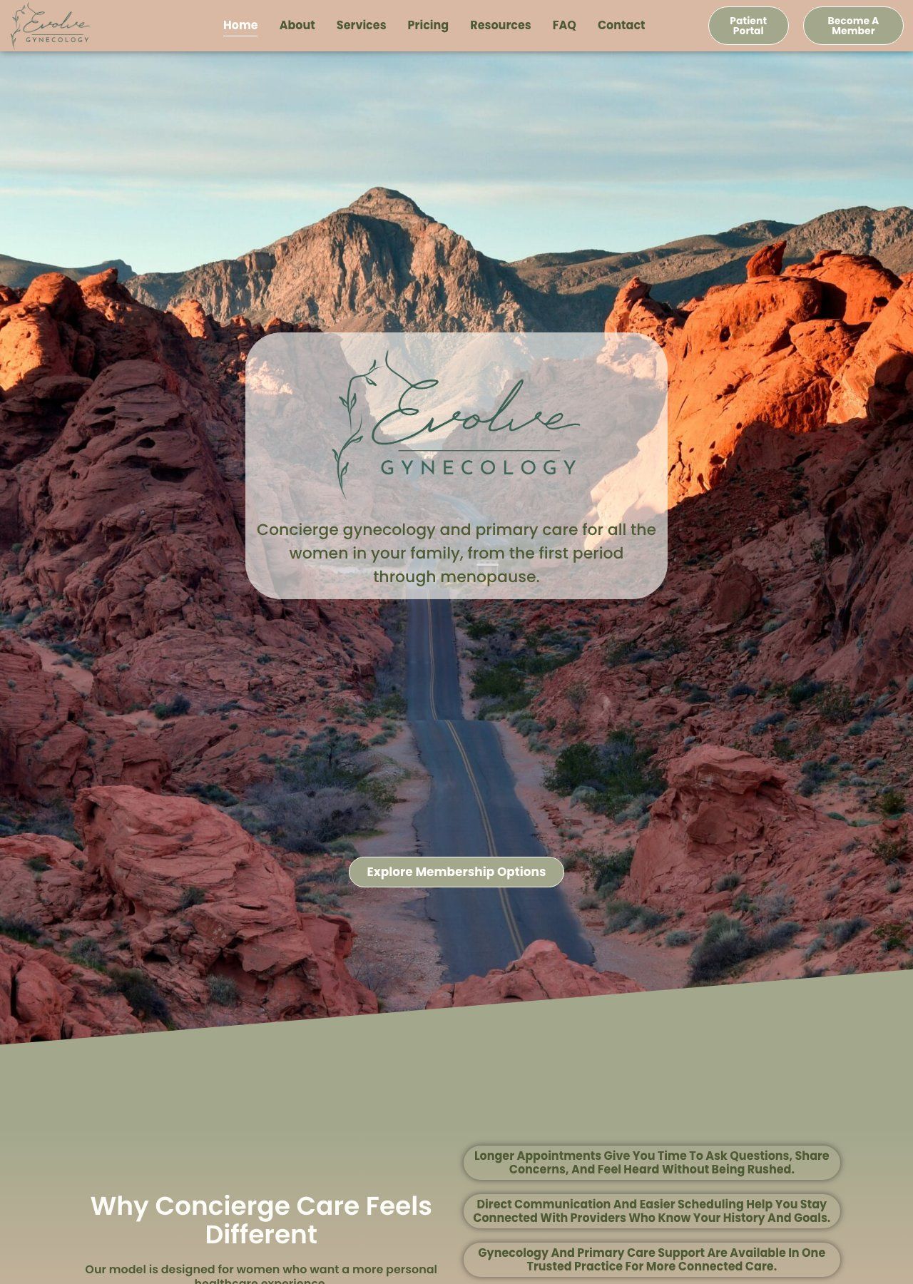
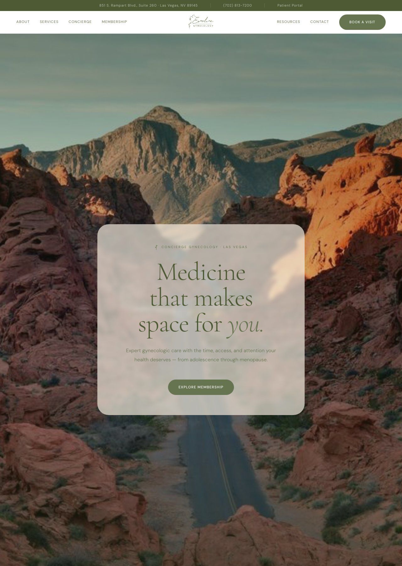
Left: What patients landed on after clicking through our SEO results and social posts: logo repeated twice, gradient background, no photography, generic institutional headline, zero concierge signal. Right: What the practice actually is. Full-bleed location photography, editorial serif headline, clear concierge positioning in the first three seconds.
Drag to compare
Content & services
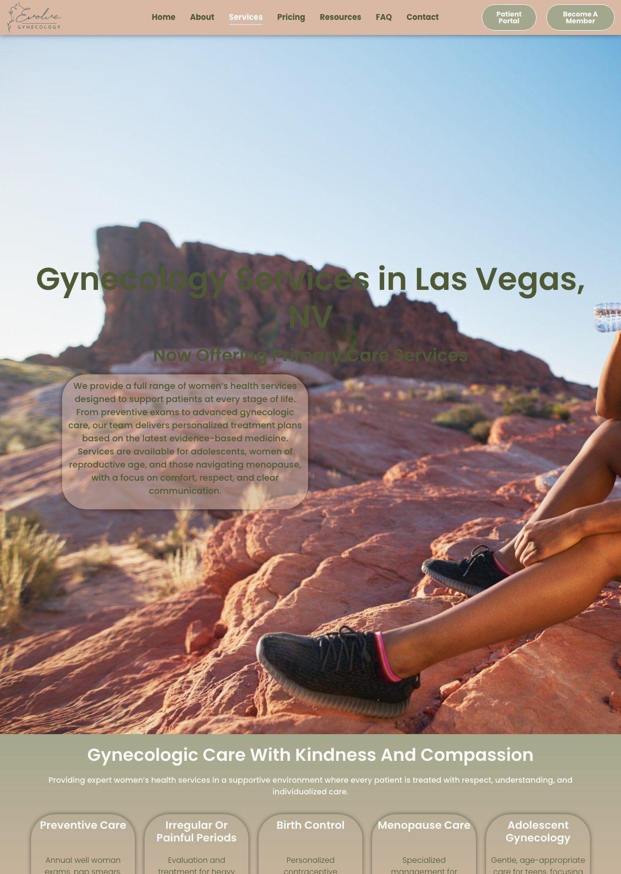
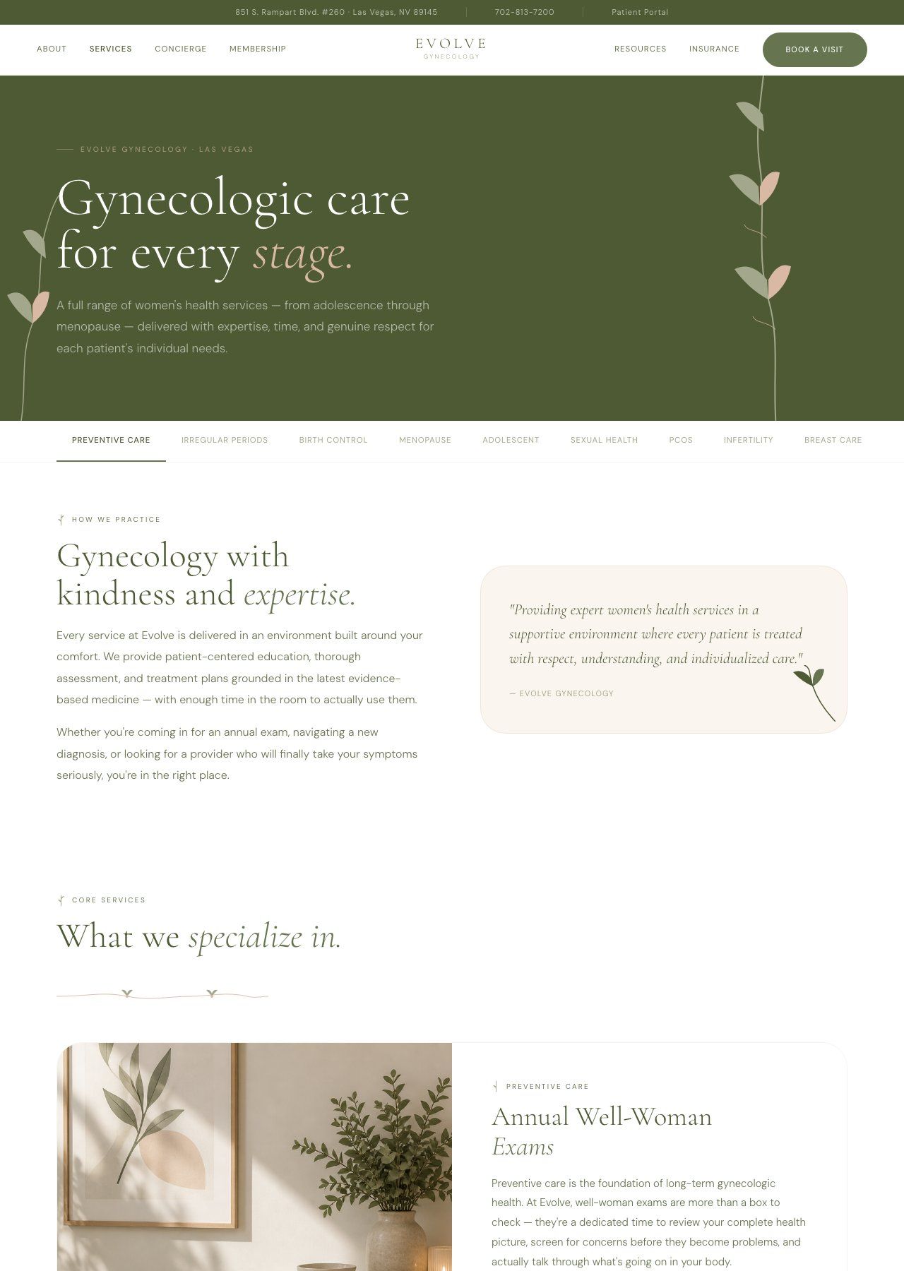
Left: Four equal-weight service cards with Shutterstock placeholder imagery and no hierarchy. Indistinguishable from any insurance clinic built in a page builder. Right: An editorial layout using real clinical photography and spatial hierarchy that reflects a curated, physician-led practice.
Drag to compare
The membership pitch
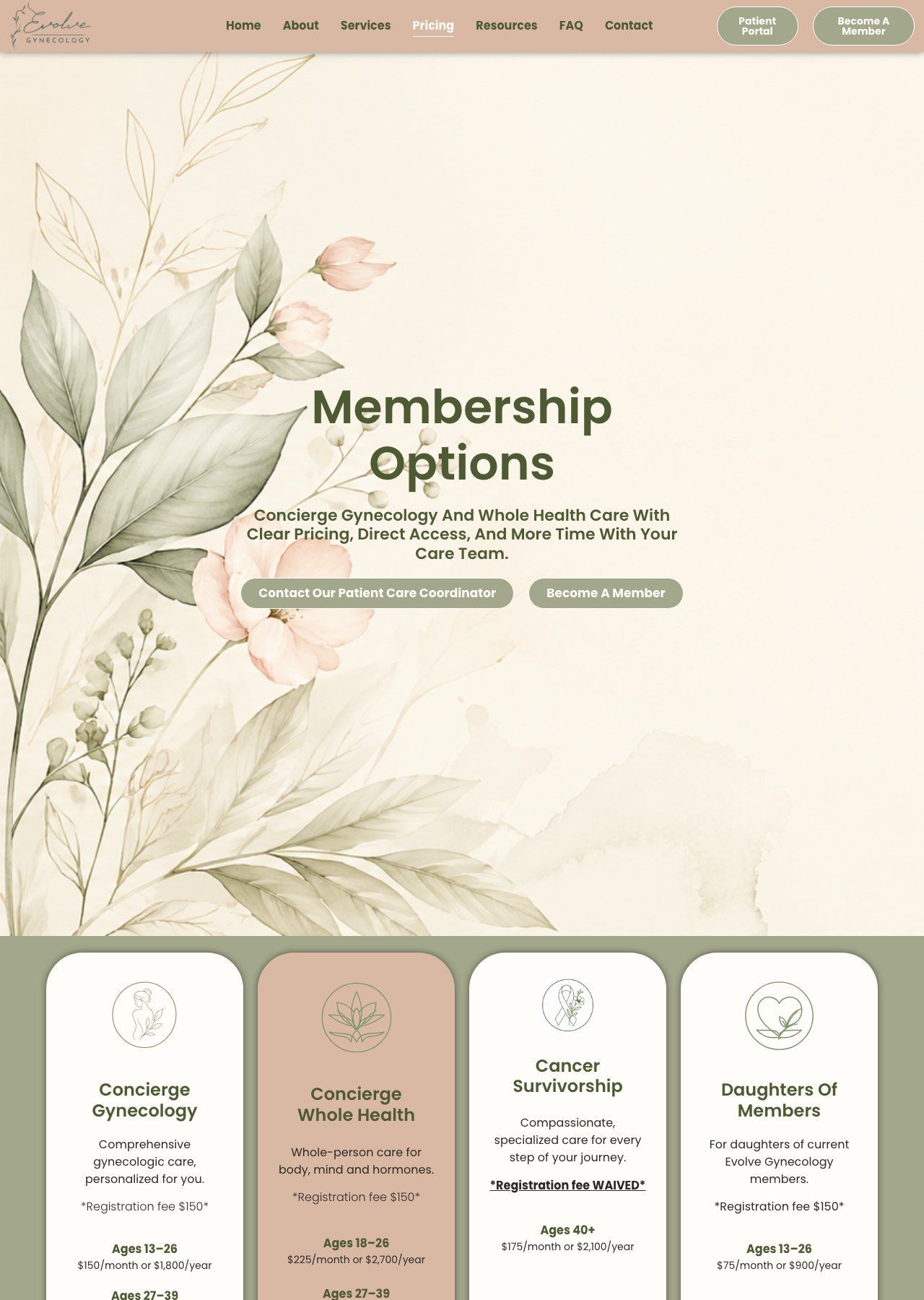
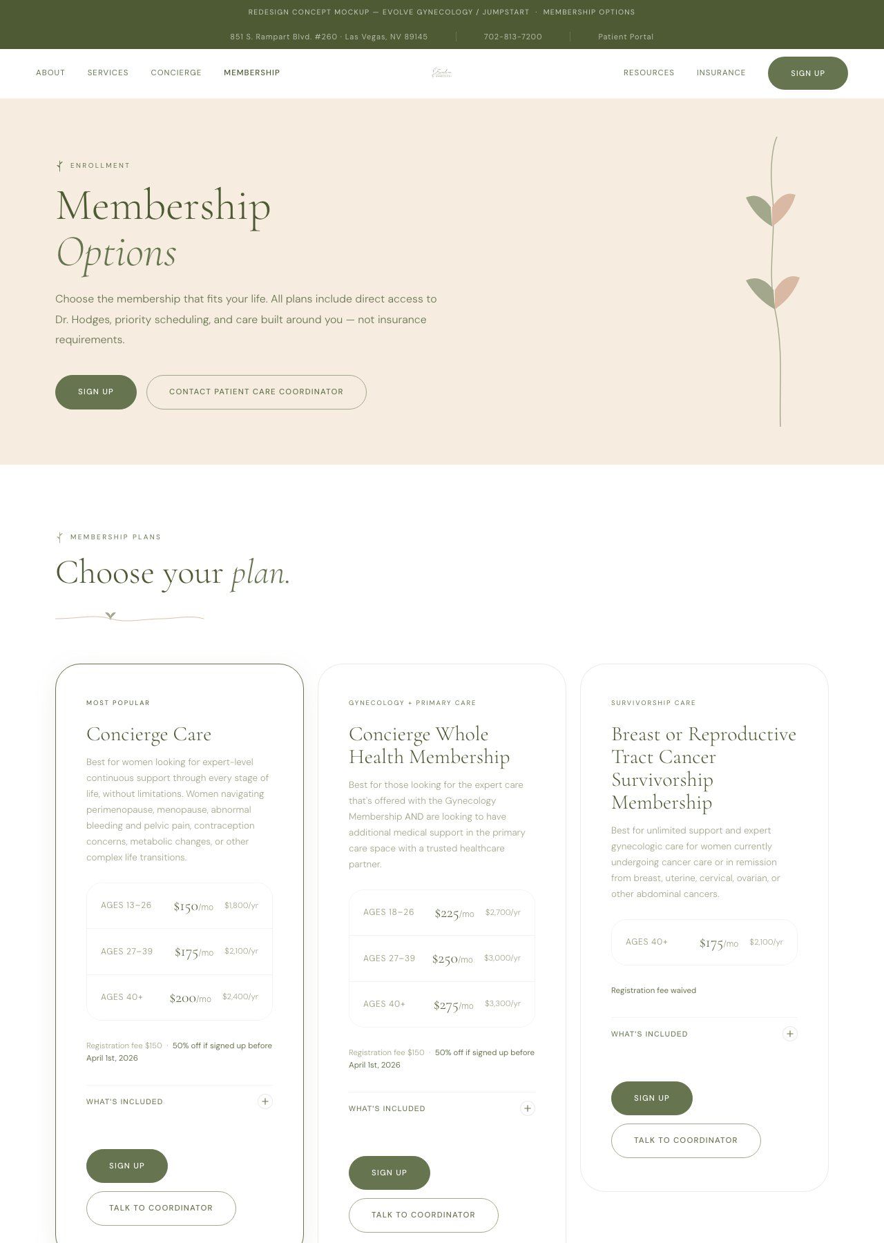
Left: Generic pricing cards at the very bottom of the page. The entire concierge model reduced to a footnote after the patient had already read through two full screens of insurance-era copy. Right: Every section now earns its place. The membership pitch is the third section on the page, not the last.
Drag to compare
Meet Dr. Hodges-Wills
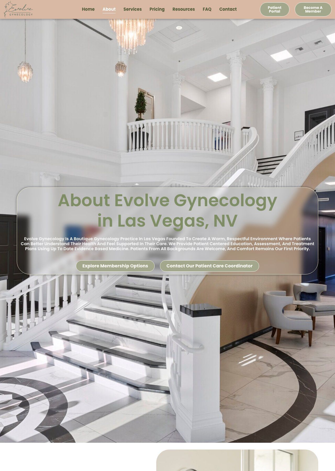
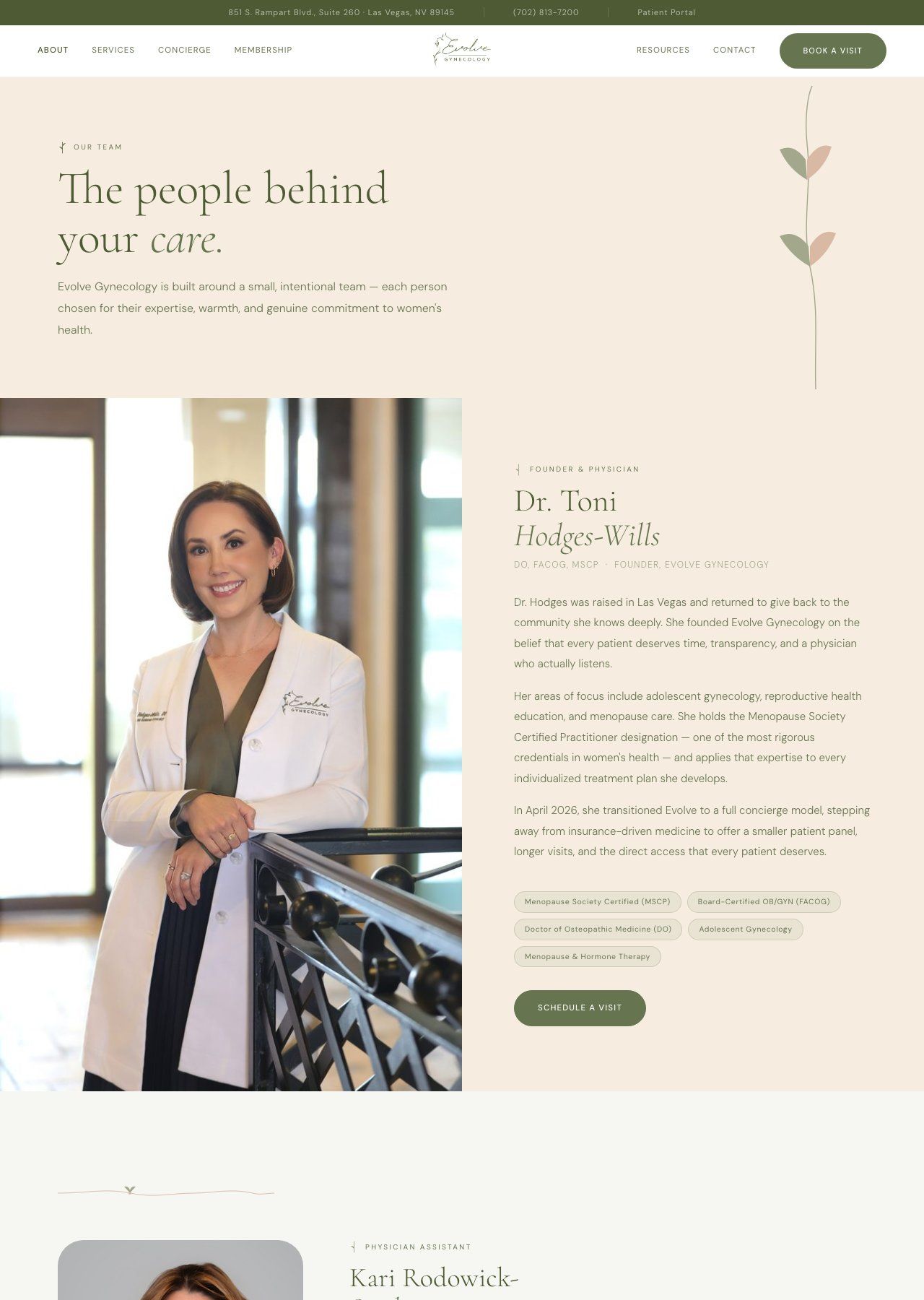
The About page went from a lobby stock photo with centered all-caps text to a full physician biography built around Dr. Hodges-Wills' credentials, warmth, and care philosophy.
Drag to compare
Contact
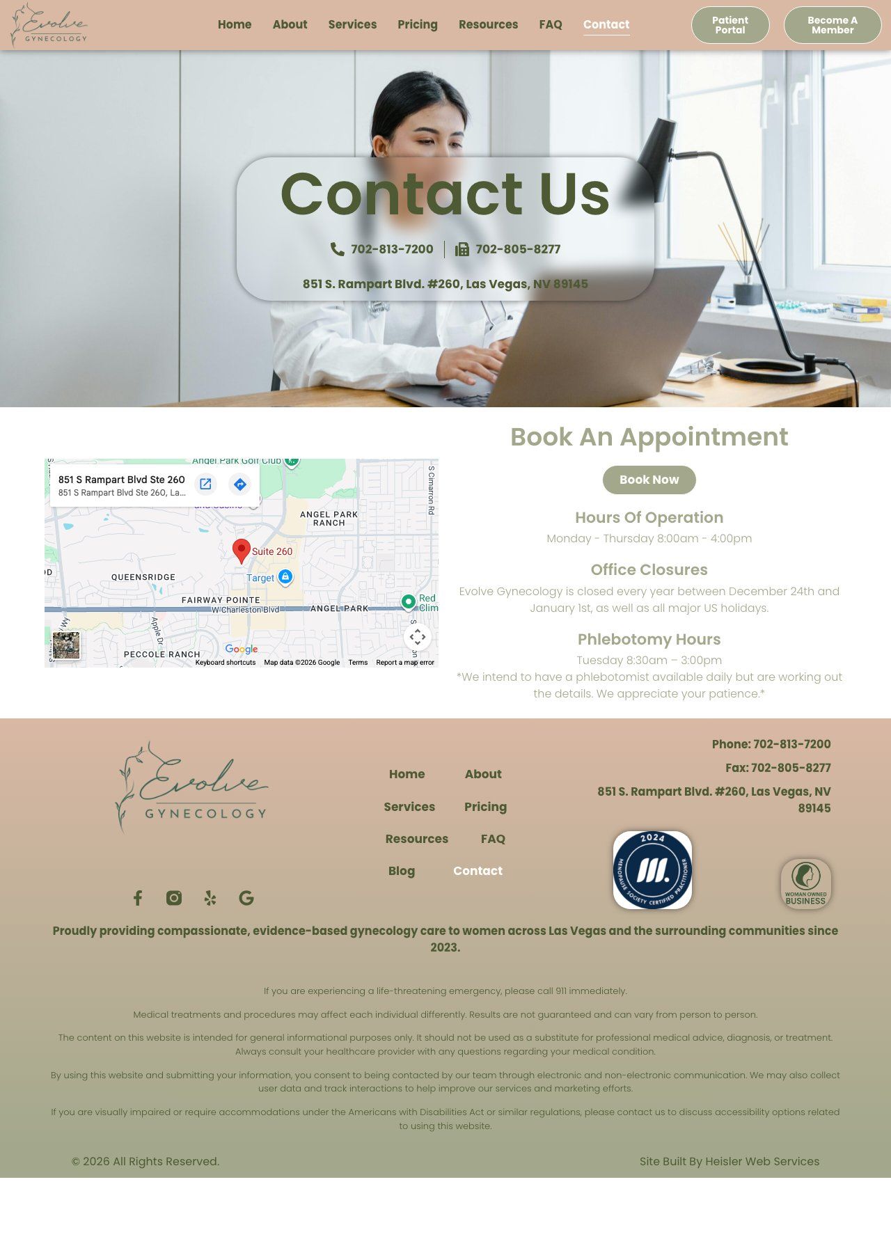
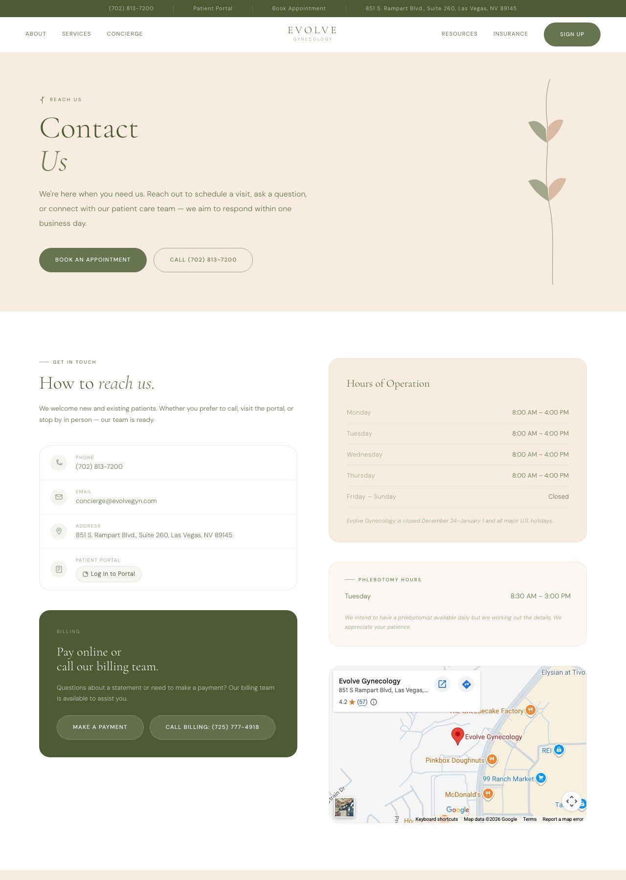
The old contact page had a generic form with no clear next step. The new version leads with direct booking CTA, hours, and phone — optimized for patients who are ready to act.
Drag to compare
Patient resources
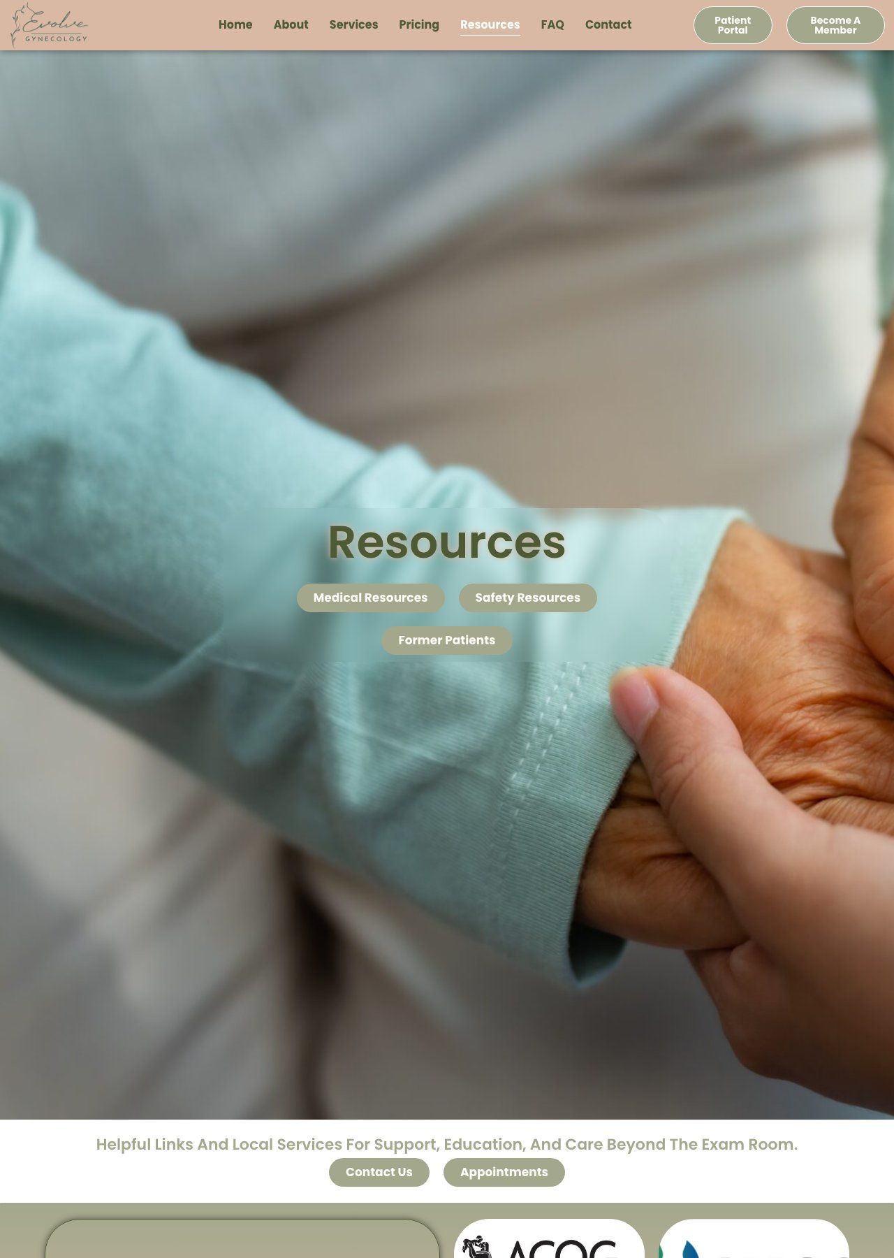
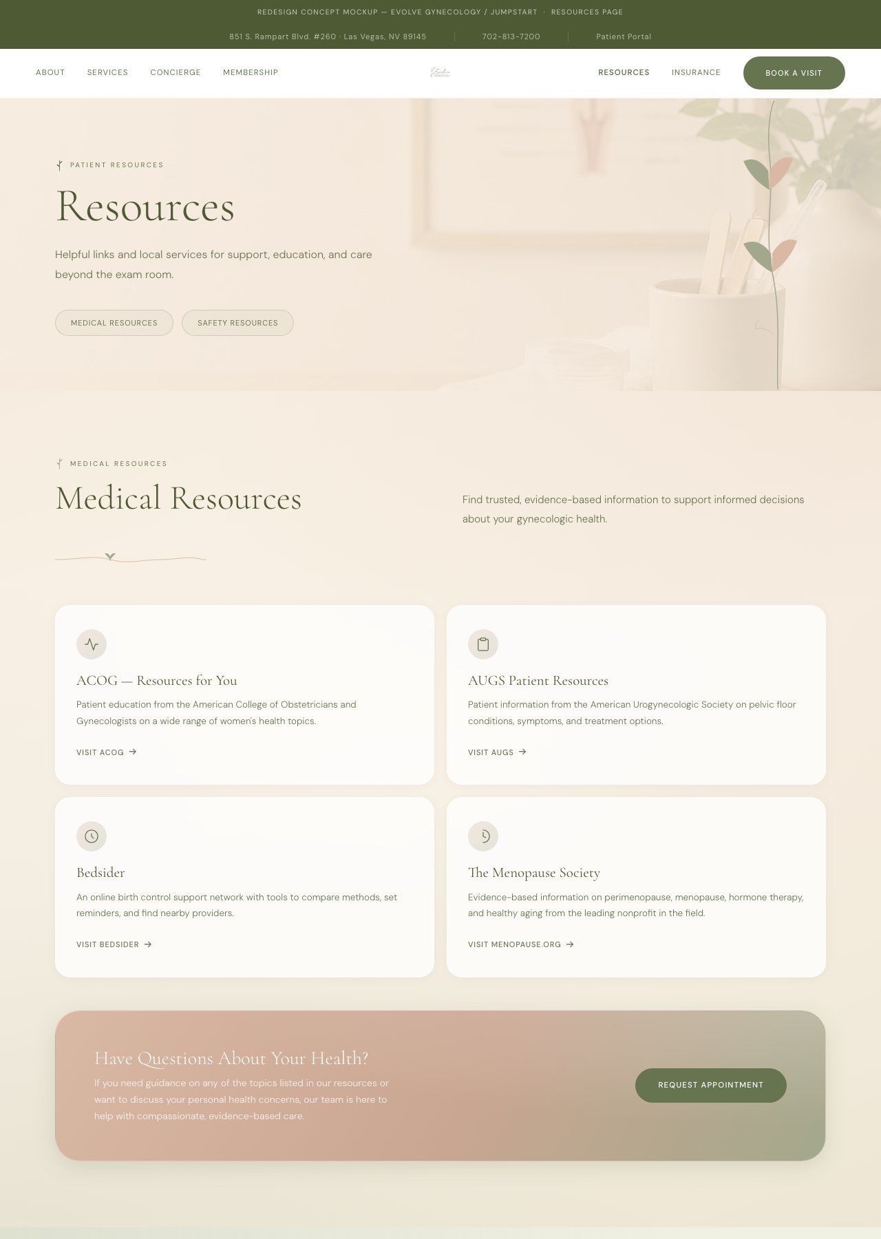
Resources went from a plain blog listing to a structured patient education hub with content matched to the concierge positioning and Dr. Hodges-Wills' areas of expertise.
Drag to compare
Built a site that closes what the marketing opens.
Every decision in the rebuild traced back to a single brief: make the website say the same thing our SEO, social, and content were already saying.
1
Positioning
Concierge front and center, not buried after the about section
Every social post and SEO article we produced was about concierge care: unlimited visits, direct physician access, no insurance hurdles. The old website mentioned membership pricing once, late in the scroll, as a pricing module. We moved the membership pitch to section three: visible before a patient has scrolled past one screen of content.
Before
Membership pricing module buried below "Why Concierge Care?" checklist, below "About the Practice." A patient could leave without ever seeing it.
After
Membership is section three. The two tiers (Concierge Gynecology at $150/mo and Concierge Whole Health at $225/mo) are presented editorially with clear differentiation before the patient reaches the about section.
2
Visual Standard
Raised it to match the brand we were already publishing
Our Instagram content was built around warm, editorial visuals and physician-led copy. The old site had blocky sections, tight padding, identical Shutterstock card grids, and Poppins at the same weight across every element. We brought the website up to the visual register of everything else: editorial serif typography, a real photograph of the Nevada landscape where the practice is rooted, and breathing room that signals premium care.
Before
Gradient hero, no photography, early-2000s HTML feel. Blocky sections with poor padding. Poppins at similar weights throughout. Zero typographic hierarchy.
After
Full-bleed landscape photograph. Cormorant Garamond at 82px for the hero headline. Macro-whitespace throughout. Looks like the practice it is.
3
Copy Voice
Rewrote every word to match what we'd already been publishing
We write Evolve's Instagram captions, LinkedIn posts, and SEO content in a specific voice: direct, warm, physician-led, second person. The original site copy was institutional third person — "Evolve Gynecology provides patient-centered education, assessment, and treatment plans that utilize up to date evidence-based medicine." That sentence would never make it into a JumpStart caption. We rewrote every section on the site with the same brief we use everywhere else.
Before
"Evolve Gynecology provides patient-centered education, assessment, and treatment plans that utilize up to date evidence-based medicine."
After
"Expert gynecologic care with the time, access, and attention your health deserves — from adolescence through menopause."
4
Technical
Rebuilt clean and handed off on a platform they actually own
The original site ran Elementor Pro, jQuery, EAEL widgets, WP Smush, and fourteen external CSS files. Every page load was carrying the weight of a page builder the site no longer needed to grow. We stripped all of that and rebuilt the design from scratch, then deployed the final product on Duda — so the client can log in and edit content directly, any time, without a developer on call. No plugin stack. No maintenance overhead. They own the site and are not tied to a tech team.
Before
Elementor Pro, jQuery, EAEL, 14 external CSS files. Footer credits Heisler Web Services. Client doesn't own the code.
After
Rebuilt from scratch, deployed on Duda. Client logs in and edits directly — no developer required, no plugin stack to maintain. They own the site outright.
Before & After
The details that made the difference.
The original site launched on Elementor with default template choices — Poppins at two weights, white backgrounds, blue CTA buttons, tight spacing. Nothing was broken. Everything was generic. Here are four places the redesign changed the math.
1
Navigation
Full-width bar vs. floating three-column nav
The original nav was a white Elementor sticky bar spanning the full viewport — logo image on the left, links in the center, a blue "Become a Member" pill on the right. A utility bar above it added a second tier of links. The redesign collapses both into a single, centered floating element: nav links left, logo center, nav links + pill right. It disappears into the page rather than competing with it.
Before

After

What changed
Removed the utility bar entirely — that content moved to the footer. Eliminated the logo image file (replaced with typeset wordmark). Nav structure went from left-logo / center-links / right-CTA to a symmetrical three-column grid with the logo anchored at center. Seven nav links reduced to six. CTA changed from a squared button to a full-radius pill.
2
Hero / Above the Fold
Text block on white vs. immersive photo with glass overlay
The original hero was a two-column Elementor layout: practice copy on the left, a photo on the right — the default "split hero" pattern used by thousands of WordPress medical sites. The redesign makes the full viewport the hero: a full-bleed background photo of the practice, with a centered glass card containing the headline and CTAs. The image does the selling; the card focuses the action.
Before
Concierge gynecology and primary care for all the women in your family, from the first period through menopause.
PHOTO
After
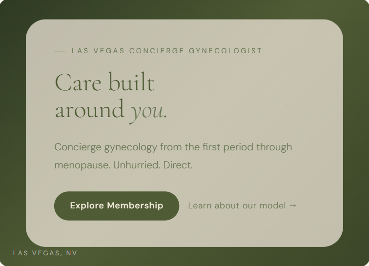
What changed
Layout went from a 50/50 split (text | photo) to a full-bleed hero with a frosted glass card centered over a background image. The headline shortened from a functional descriptor (29 words) to a single editorial statement (4 words + subhead). CTA hierarchy added: primary pill + secondary ghost link instead of one button doing both jobs.
3
Services
Icon list vs. card grid with editorial anchor
The original services section was five Elementor icon-list items: icon + bold service name + one-line description. Readable, unremarkable. The redesign leads with a full-width featured card for Menopause Care (the practice's specialty credential and price anchor), then a 3-column card grid below. The featured card earns its size — it's the service that justifies the price point.
Before
Comprehensive care for every stage of life
We continue to provide evidence based gynecologic care through every stage of reproductive life.
Gynecologic Preventative Care
Routine well woman care, screenings, contraception guidance, and support for common gynecologic concerns.
Menopause Care
Evidence-based care for perimenopause, menopause, and beyond, guided by experience and individualized to your needs.
Adolescent Gynecology
Gentle, age-appropriate care for teens and young adults, with a focus on education, trust, and comfort.
Primary Care
Additional care through our physician assistant offers a more complete care experience in one trusted setting.
After
What We Treat
Full-spectrum gynecologic care.
PHOTO
What We Treat
Menopause & Hormone Therapy
Certified expertise in MHT and perimenopause support. One of the few Las Vegas practices with a Menopause Society Certified Practitioner.
Preventive & Annual Care
Well-woman exams and routine screenings.
Adolescent Gynecology
Age-appropriate care for teens and young adults.
Primary Care
Whole-health support from our PA in one trusted practice.
What changed
Five equal-weight icon-list items replaced with a hierarchy: one featured card (Menopause Care, the practice's only credential-backed specialty) leading into a 3-column grid. The featured card is larger because it earns it — Dr. Hodges-Wills is one of few Las Vegas providers with Menopause Society certification. The redesign makes that the first thing a patient sees in this section.
4
Membership / Pricing
Plugin pricing widget vs. editorial tier cards
The original used the Essential Addons for Elementor pricing widget (eael-pricing style-5): a header block with plan name + price, a bullet list of features with checkmark icons, and a CTA button. The widget rendered a blue-accented card that looked identical to thousands of other WordPress pricing tables. The redesign strips the widget chrome and rebuilds from scratch with the site's own typography and motion system.
Before


After

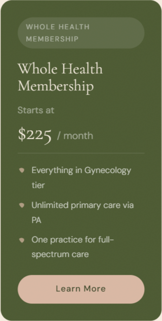
What changed
The Elementor eael-pricing widget rendered identical card chrome for both tiers — same header color, same bullet treatment. The redesign introduces a clear hierarchy: the Whole Health tier uses the forest background to signal it's the recommendation. Checkmark icons (✓) replaced with the site's leaf SVG motif — the same icon used in navigation and section labels. Plan names shortened from 4–5 words to 2.
How we convinced a client to fix a site she didn't think needed fixing.
The hardest part of this engagement wasn't the design. It was building the case that a functioning website can still be broken if it doesn't match the brand it's supposed to represent.
1
Show the disconnect
We put our Instagram posts next to screenshots of the website and asked a simple question: does this look like the same practice? It didn't. That was the argument.
2
Audit the patient journey
Mapped every touchpoint from a Google search or Instagram post to the homepage. Every path ended at the same broken handoff: great content, wrong landing page.
3
Design & copy together
Built the site using the same brief we use for every other JumpStart deliverable. Copy and design developed simultaneously. The voice that appears in the social feed is the same voice that appears on the homepage.
4
Show the disconnect
Deployed to Duda and handed off. The client can log in and edit content directly, any time — no developer required, no plugin stack to maintain. They own the site and are not tied to a tech team.
The full chain is now closed.
SEO brings the patient. Social builds the relationship. The website closes the visit. For the first time, all three are saying the same thing.
3 sec
Time to concierge positioning on the new homepage
The hero headline ("Medicine that makes space for you") lands the concierge model before a patient has scrolled. On the old site, the membership pitch came after two full sections of insurance-era copy.
1 file
No plugin stack, no page builder, no maintenance debt
The original site ran Elementor, jQuery, EAEL, and 14 external CSS files. The new site is a single clean HTML file. Zero plugin dependencies. The client owns it outright.
3 → 1
Marketing channels that now speak with one voice
SEO, social media, and the website were three channels pointing in different directions. Now they're one brand. The patient who finds Evolve on Instagram, reads a blog post, or lands from a Google search arrives somewhere that confirms what we've been telling them.
$0
Lost in the last mile: before the redesign, that answer was different
Every patient we drove to the site through SEO and social had to survive a landing page that didn't match the brand that brought them there. That gap is closed. The website is now the strongest asset in the marketing stack, not the weakest link.
JumpStart DPC Solutions
Marketing, content, and digital strategy for Direct Primary Care and specialty medical practices.
© 2026 JumpStart DPC Solutions. Confidential · intended for client and prospect presentations only.